

Build a utilization report
Put a number on how much your machines ran over a period, and find the machine that drags it down.
The Advanced Report is the utilization report: how many hours each machine ran, how many it did not, and what share of the period that is. It answers the monthly and quarterly questions that the live Assets page cannot, because it covers a period you choose rather than the current shift. The page is at /assets?select=advanced_report.
Prerequisites. Machines reporting, see Monitor your fleet on the Assets page. Every figure on this page is defined in Metrics.
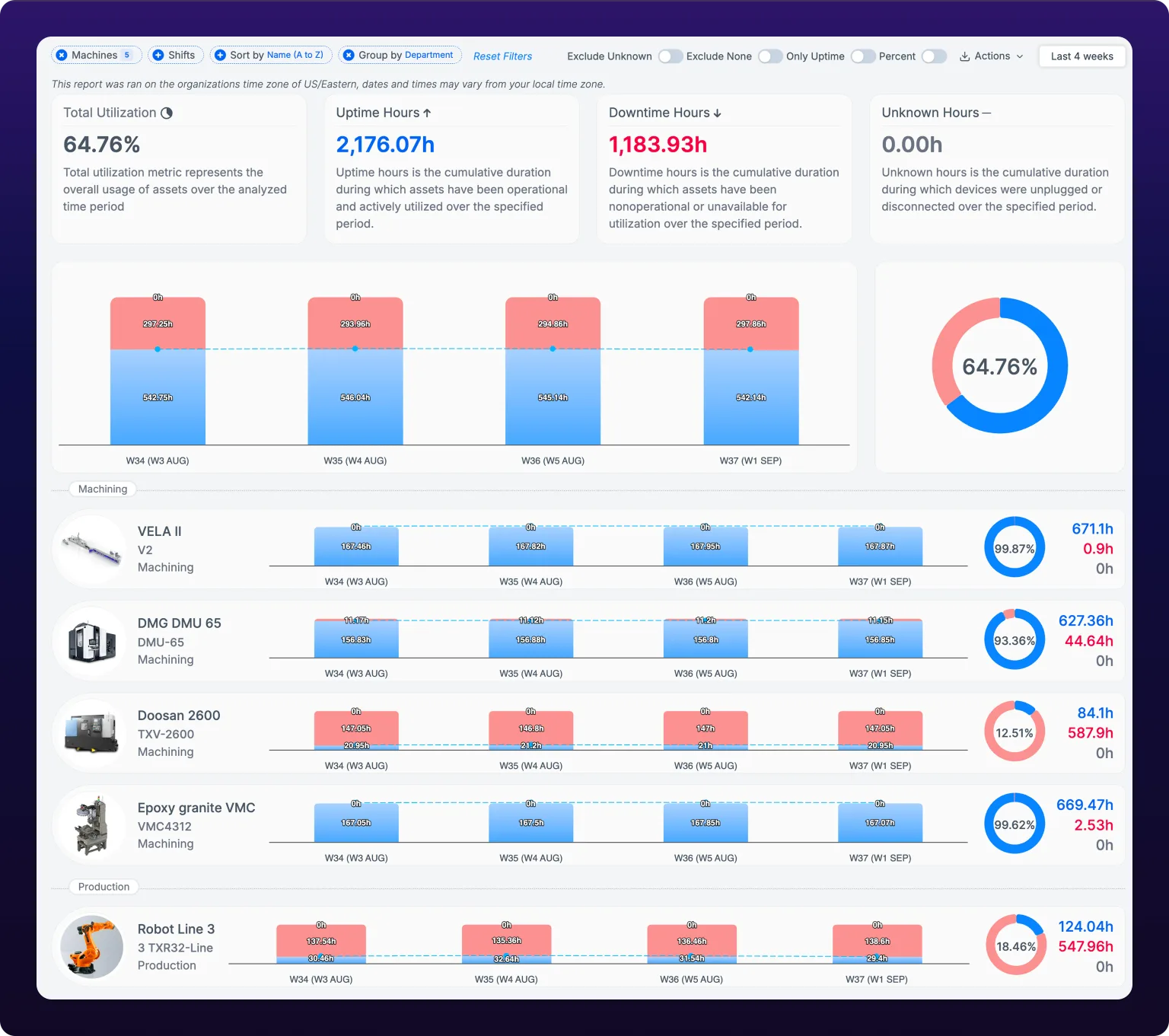 The utilization report over the last four weeks, with machines grouped by department.
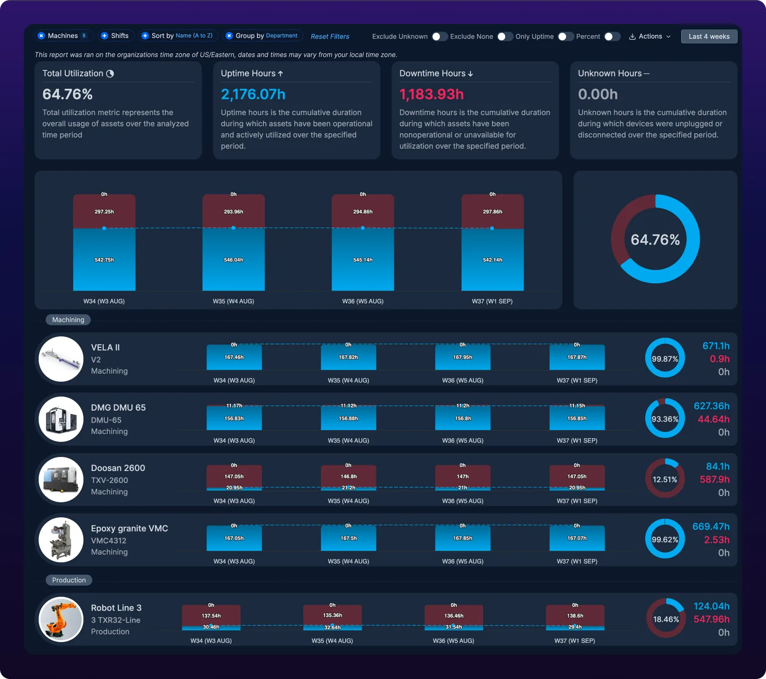
Read the report
Four KPI cards sit above the charts. Total Utilization is the share of the period the machines ran, Uptime Hours and Downtime Hours are the totals behind it, and Unknown Hours is time no sensor was reporting. Utilization here is availability, the same measure the Assets page calls uptime, see Metrics.
The stacked bar chart splits every interval of the period into uptime, downtime and unknown, so you can see whether the number moved. For example, at a weekly interval over 12 weeks, a plant that lost a week to a plant shutdown shows one bar that is nearly all red, and the surrounding bars tell you whether that was the exception.
The pie next to it carries the same three totals for the whole period, with the utilization percentage in its center.
Every time on this page is in the organization's time zone, not yours. The line under the filter bar names it, see Shifts and time zone.
Choose what the number includes
Four switches at the right of the filter bar change what the utilization figure counts and how the charts draw it.
 The four report switches: Exclude Unknown, Exclude None, Only Uptime and Percent.

Switches reference
| Switch | What it does | Recomputes |
|---|---|---|
| Exclude Unknown | Removes unknown time from the utilization calculation | Yes |
| Exclude None | Removes downtime of severity None from the utilization calculation | Yes |
| Only Uptime | Draws only the uptime series on the bar charts, dropping downtime and unknown | No, display only |
| Percent | Labels every bar as a percentage of its interval instead of hours | No, display only |
Unknown time is any stretch where the sensor was powered off or had lost its connection. It counts toward neither uptime nor downtime, and the Unknown Hours card and the gray band on every chart carry it as its own bucket. For example, a machine whose SenseAi was unplugged for a weekend shows 48 unknown hours, not 48 hours of downtime. A machine with a large unknown figure has a connectivity problem, not a production one, see Troubleshoot a device that is offline.
None is a downtime severity, given to categories whose stops are not a loss. The purpose of None is legally required breaks: a mandated one-hour lunch is downtime on the sensor, but no one is accountable for it. Which categories carry it is set in Manage downtime categories.
Exclude Unknown and None when you are comparing machines or holding someone to a number. A machine that lost Wi-Fi for two days and a department that takes a longer mandated break both look worse than they are with the switches off. Leave them in when the question is where the shift actually went, because a number that excludes the lunch hour and the dead sensor no longer adds up to the length of the shift.
Only Uptime and Percent change nothing about the figures. They redraw the charts from data already loaded, so flipping them costs no wait, and they are recorded in the report's URL so a shared, scheduled or PDF copy renders the same way.
Find the machine that drags the number down
Under the charts is one row per machine: its photo, name, identifier and department, its own stacked bar per interval, its own pie, and its uptime, downtime and unknown hours for the period. Click a row to open the machine, see Inspect a single machine.
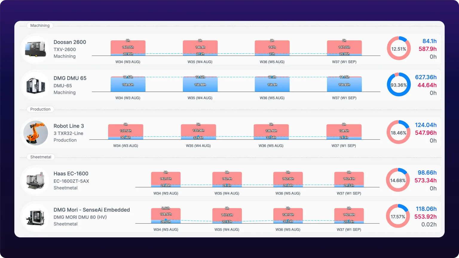 Per-machine rows grouped by department, which is where a single bad machine shows up.
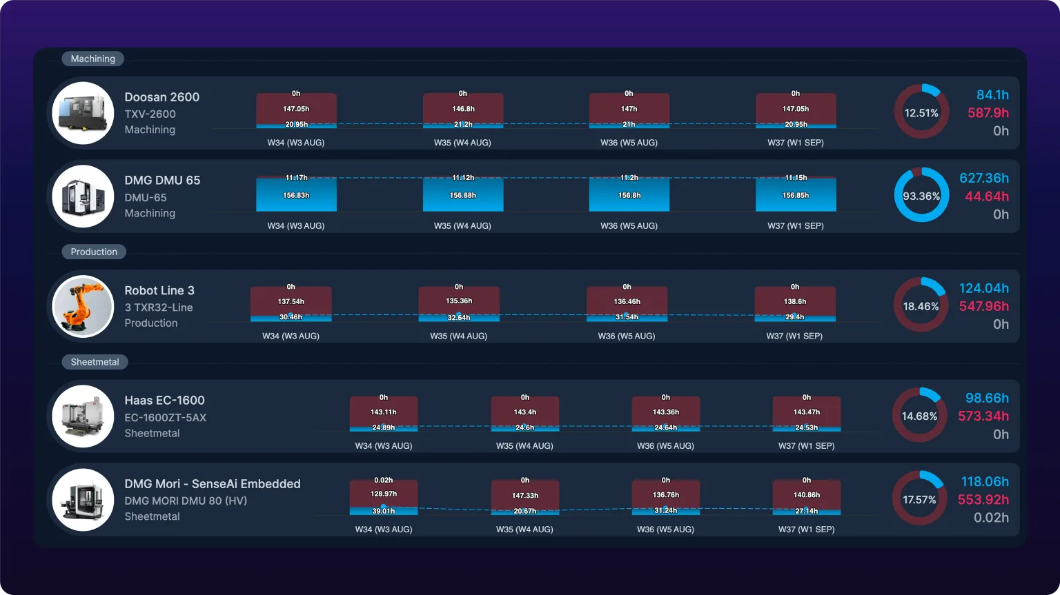
Two controls in the filter bar order the rows.
Sort by offers Name (A to Z), Name (Z to A), Top Performing and Worst Performing. Choose Worst Performing when the fleet number has dropped and you want to know which machine did it: the row at the top is the answer. For example, a machining department whose DMG DMU 65 runs at 93.36% while the Doosan 2600 beside it runs at 12.51% has one problem, not a department-wide one.
Group by has one option, Department, which puts a dashed heading over each department's machines. Choose it when you report to department leads, so each reads their own block. You do not need it for a single department.
Set the period and filters
The date button at the far right of the filter bar opens the period picker. It has two parts: an interval, and a range.
- Pick an interval: Daily, Weekly, Monthly, Quarterly or Yearly. One bar on the chart is one interval.
- Pick a range. The presets change with the interval, and each is a rolling window, so the same report reopened next week shows next week's data.
- For fixed dates, click Custom range and pick a start and end. A custom range is frozen and reopens on the same dates.
| Interval | Presets |
|---|---|
| Daily | Last 7 days, Last 14 days, Last week (Mon - Sun) |
| Weekly | Last 4 weeks, Last 6 weeks, Last 8 weeks, Last 12 weeks |
| Monthly | Last 3 months, Last 6 months, Last 9 months, Last 12 months |
| Quarterly | Last 2 quarters, Last 4 quarters, Last 8 quarters |
| Yearly | Last 2 years, Last 3 years, Last 5 years |
Choose a rolling preset for a report someone opens every week or receives on a schedule. Choose a custom range for a before-and-after comparison, for example the four weeks before a spindle rebuild and the four weeks after, where the dates must not move.
Machines narrows the report to selected departments or individual machines. Shifts counts only time inside the shifts you tick, so a night-shift report excludes the day shift's hours. Reset Filters clears the machine, shift, sort and group settings and keeps the period and the exclude switches.
Shift islands
The Shift islands toggle at the top of the Shifts popover decides where an overnight shift's hours land. Off, which is the default, the report splits the shift at midnight: a 10:00 PM to 5:00 AM shift reports two hours on its start date and five on the next. On, all seven hours report on the start date.
Turn it on whenever you are reporting a shift that crosses midnight. It changes nothing for a shift that does not, so leaving it on costs a day-shift report nothing. For what the split does to the numbers, see Where the overnight hours land.
Like the shift ticks, the toggle takes effect on Apply, and Clear resets it along with the shift selection. While it is on, the report carries an Islands badge on the collapsed Shifts button, which is the only place the setting is visible once the popover closes.
Turning it on also hides All Day (24/7) from the list, and clears it if you had it ticked. A 24-hour window has no start day to move hours onto, so the two settings cannot both apply.
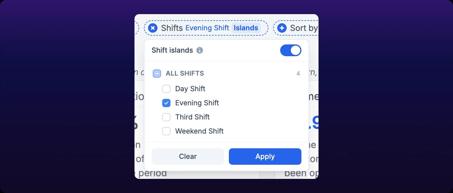 The Shift islands toggle sits at the top of the Shifts popover. Turning it on hides All Day (24/7), because a 24-hour window has no start day to move hours onto.
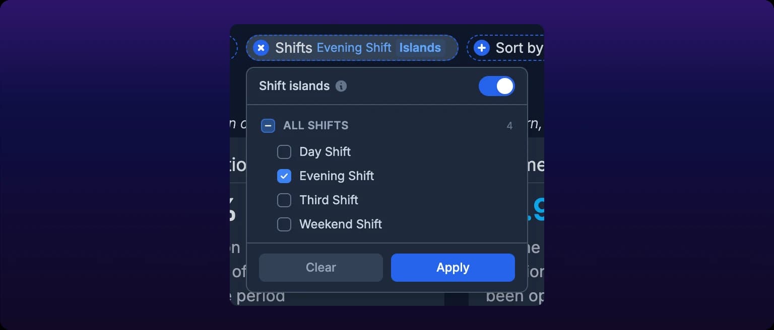
The setting travels with the report everywhere it goes. A shared link, a scheduled email, a PDF and a CSV are all built from the report's URL, so the recipient opens the report you built. The Report Summary in the share and schedule dialogs names the setting in both states, and the CSV title block records it when it is on, see Share and schedule reports and Available exports.
Export the report
The Actions menu at the right of the filter bar downloads the report in two forms, both using the filters and switches you have set. What each export carries is listed in Available exports.
Export formats
| Format | Contains | Where it goes |
|---|---|---|
| CSV | A header block naming the date range, time zone, shifts and active switches, then one row per machine per interval with uptime, downtime and unknown hours and percentages, plus the machine's tags | Utilization_Report_<from>_to_<to>.csv in your downloads |
| The report as rendered, cards, charts and rows included | Utilization_Report_<from>_to_<to>.pdf in your downloads |
Download a CSV
- Set the period, filters and switches.
- Open Actions.
- Click Download as CSV.
The file opens with a header block, so a spreadsheet built from it records what it was: Utilization Report - Aug 18, 2026 - Sep 14, 2026, the generation date and time zone, the shifts, and a line for each exclude switch that was on. The rows below carry Department Name, Asset Name, Asset Identifier, Period, Category, Uptime Hours, Downtime Hours, Unknown Hours, the three percentages, and Tags. Choose CSV when you want to pivot the rows yourself, for example uptime by tag across every machine tagged cell-3.
Download a PDF
- Set the period, filters and switches.
- Open Actions.
- Click Download as PDF.
- Wait for Generating PDF report… this may take a few seconds. to become PDF report generated successfully.
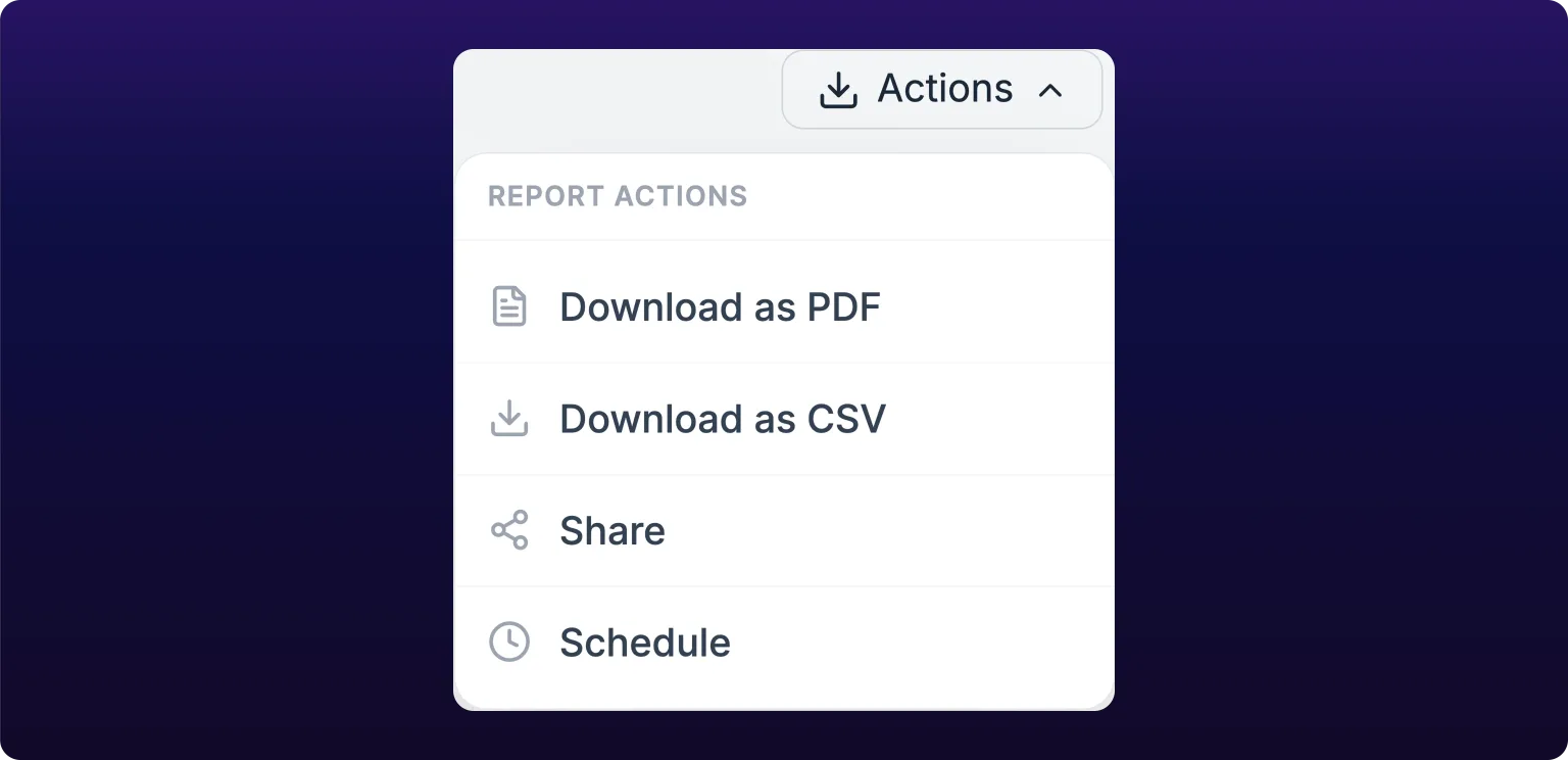 Generating the PDF. The previous documentation hedged this as 'if available'; it exists.
The PDF is rendered from the report exactly as you see it, switches included. Choose PDF when the reader needs the picture rather than the rows, for example a monthly review with a plant manager.
You do not need to export to get the report to other people. Share emails the current view to members of your organization, and Schedule sends it on a cadence, see Email a report and schedule it to repeat.
Export errors
| Message | Means |
|---|---|
| Failed to download CSV. Please try again. | The browser could not build the file. Wait for the report to finish loading and retry |
| Something went wrong generating the PDF. | The PDF service could not render the report. Retry; if it repeats, narrow the date range |
See also
From the blog
- Add a shift, buy a machine or recover lost hours?Recover lost hours first, add a shift when you can staff it and buy a machine when you can’t. Each route priced per good part on one CNC lathe, by hand.
- What is machine utilization, and how do you calculate it?Machine utilization is running time divided by the time a machine could have run. Learn the four denominators, work one week by hand and pick the right one.
- What utilization to expect by machine typeA manual CNC runs 40–60% of the shift, a coil-fed press 65–80% and a lights-out cell 80–90%. See why loading sets the ceiling and how to set each goal.
Read the Event Alerts list on a machine's Health tab: what an event is and how it differs from the rule that fired it, the severity and type filter pills, how rows are grouped by age and sorted, dismissing one event or a whole time group, and the two ways an event becomes a work order.
The Operator Performance report at /assets?select=operator_performance pairs each operator with the machine they worked and totals the machine's uptime percentage, uptime hours and downtime hours for their clocked sessions. Sessions come from sign-ins on a paired operator station, so the report's real job is finding sessions that were never closed. Filter by machine, operator and a window of up to 31 days, read each card as stacked hours per session or as a status strip, add or correct clock entries by hand, and export the whole report as CSV. Owner or Administrator, web only.