

Monitor machine health and vibration
Read the health dashboard well enough to tell degradation from noise.
The Health tab turns the sensor's vibration stream into one score, seven condition gauges, a frequency spectrum and fourteen trend charts. This page says what each surface shows and stops there: the score bands and gauge thresholds are IoTFlows' own and are still being tuned.
Prerequisites. A SenseAi or SenseAi Embedded asset on firmware 5 or later; the firmware is listed in View your devices. A baseline profile, see Choose a machine health baseline profile. The Health tab does not exist for a BeamTracker asset, because a beam sensor reads no vibration.
Open the Health tab
- Open the machine's page at
/assets/selected-asset/:id, or click its card on the Assets page. - Click Health in the tab strip under the header, between Jobs and Meters.
The baseline profile dropdown at the top left names the profile the score is measured against. The time range buttons at the top right set the window every chart shows, from 1h to 2y. The dashboard opens on 7d.
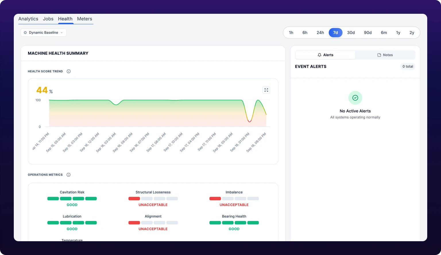 The machine health dashboard. Read the trend before the number.
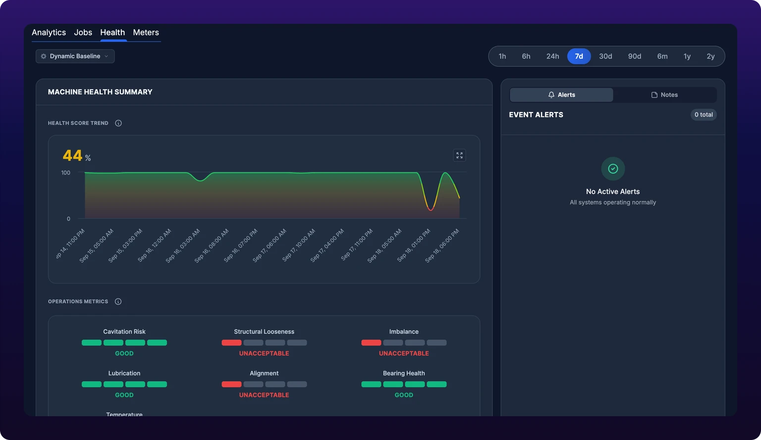
The health score and its trend
The health score is a number from 0 to 100 that summarizes the machine's vibration against its baseline. It is a proprietary IoTFlows calculation derived from the vibration metrics shown lower on the same page, RMS and crest factor among them. IoTFlows does not publish the weights.
The Health Score Trend chart at the top of the Machine Health Summary card draws the score across the selected range, with the latest value in its corner. Widen the range to see whether a move is a day's noise or a month's slope.
Read the trend before the number. A score of 62 that has been 62 for a month is a machine with a noisy baseline. A score of 78 that was 94 last week is the one to open a work order on.
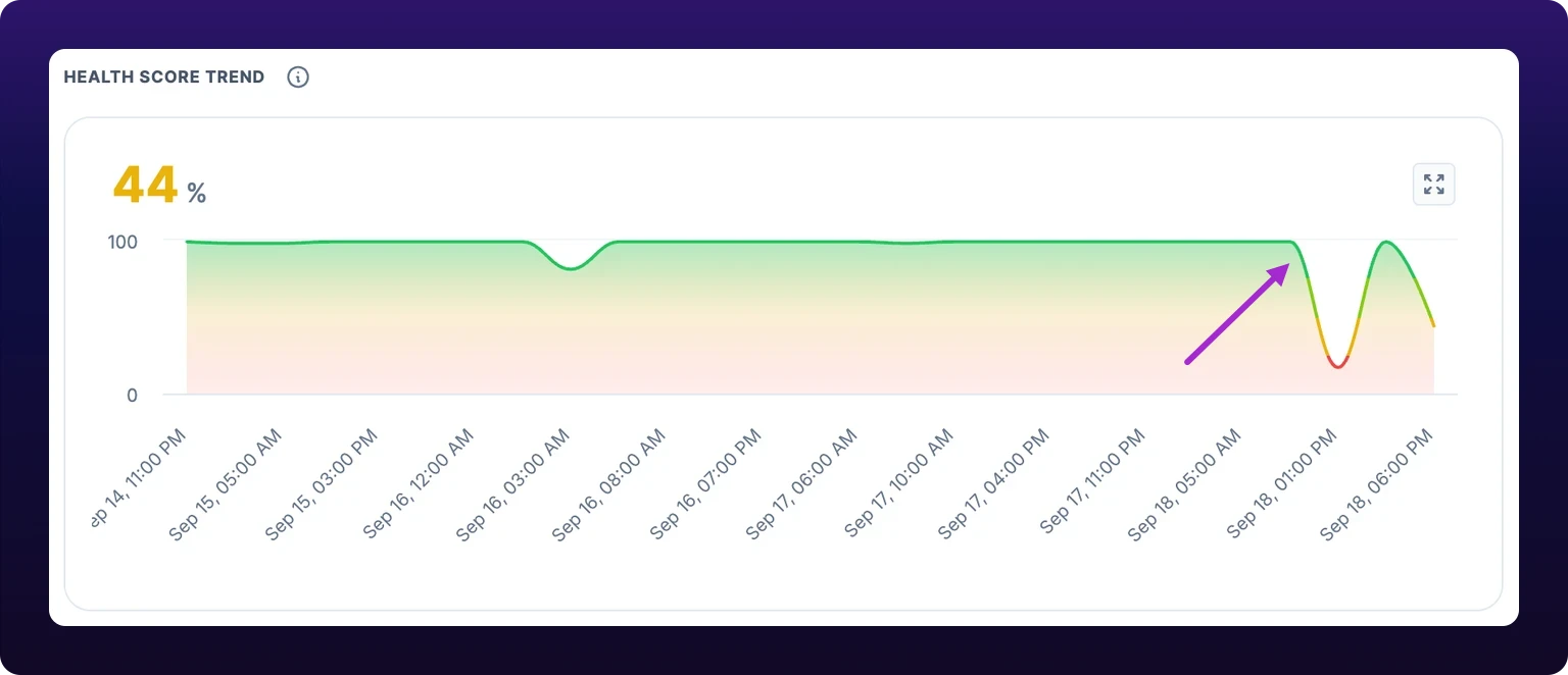 A score of 62 that was 94 four weeks ago. This is the shape that justifies a work order.
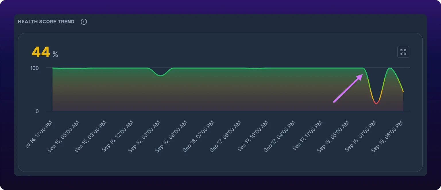
Bearing health and the operations metrics
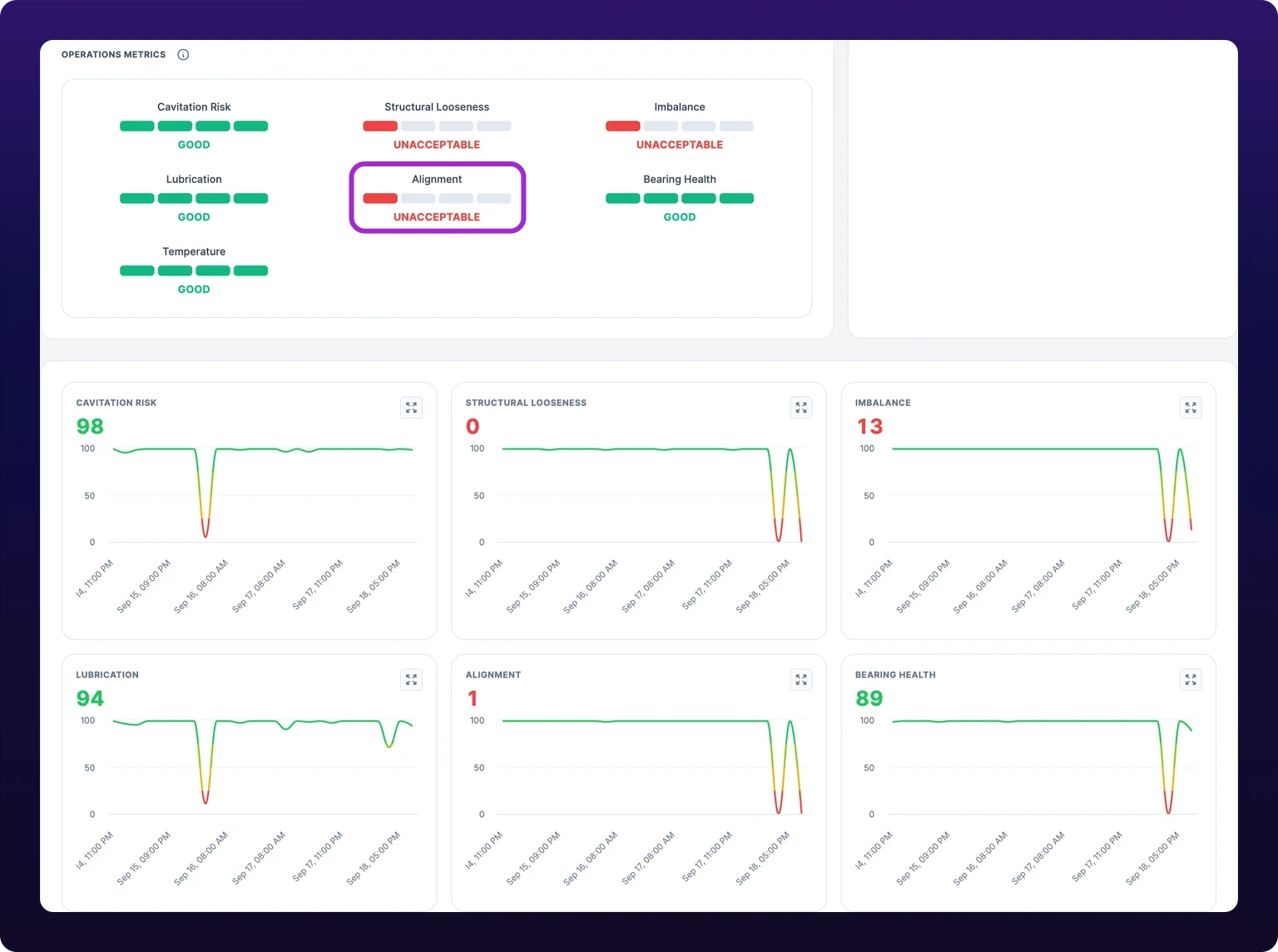
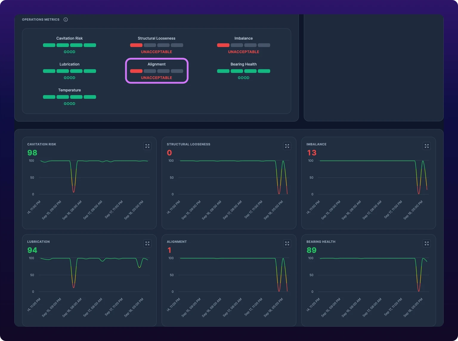
Bearing health is a score for the rolling elements of the machine, derived from the high-frequency part of the vibration signal where bearing defects show first. It is one of seven Operations Metrics gauges under the health score trend. Each gauge fills one to four bars and carries one of five labels: Good, Satisfactory, Unsatisfactory, Unacceptable or No Data.
| Gauge | What it scores |
|---|---|
| Cavitation Risk | Vapor bubbles collapsing in a pump or hydraulic system |
| Structural Looseness | A mount, foot or fastener that has worked loose |
| Imbalance | A rotating part whose mass is off center |
| Lubrication | Bearing lubrication breaking down |
| Alignment | Shafts or couplings that are out of line |
| Bearing Health | Wear or damage in the bearings |
| Temperature | The sensor's temperature reading, when the device reports one |
Each gauge except Temperature has its own trend chart below the summary card, so you can see when a condition began. Watch the bearing gauge first: bearing damage is the fault a vibration sensor catches earliest, and the one with the longest lead time before failure.
 The Bearing Health gauge at Unsatisfactory, and its trend chart below the summary card.
Read the three axes
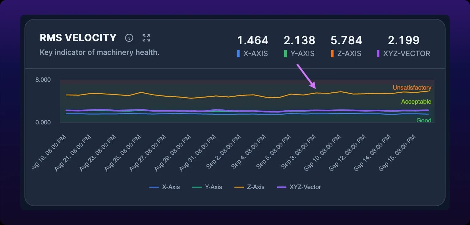
A SenseAi reads vibration on three axes, X, Y and Z, and combines them into XYZ. Every metric trend chart draws all four as separate lines, and the FFT section draws a spectrum for each.
Compare the axes when a metric rises. All three moving together is wear or load. One axis moving alone points at a directional fault, most often alignment or looseness: a shaft out of line pushes in one direction, and a loose foot rocks in one plane.
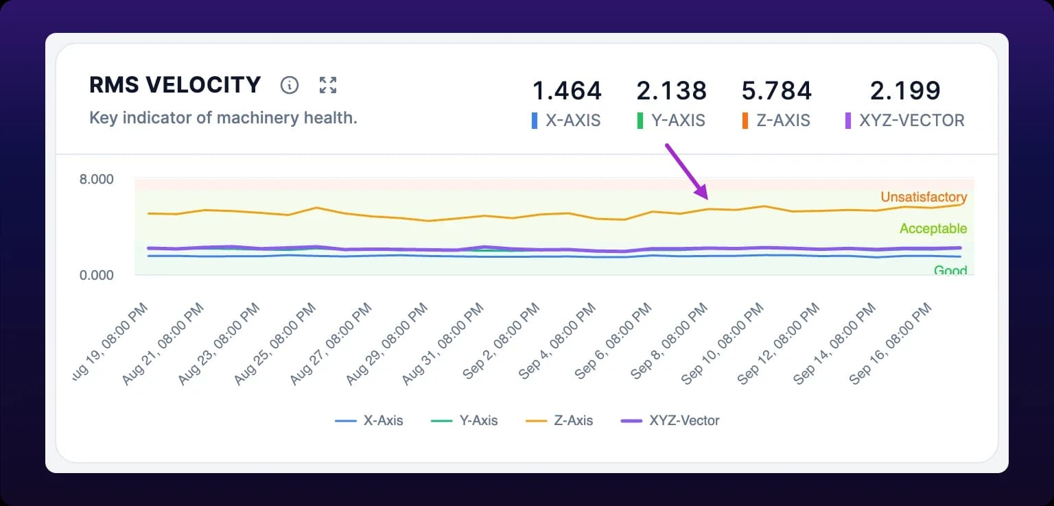 Three axes on one trend chart. One axis moving on its own points at alignment rather than wear.
The FFT spectrum
An FFT (fast Fourier transform) splits a vibration signal into the frequencies it contains, so a chart of amplitude against frequency shows which rotations and impacts are producing the vibration. The dashboard draws four: XYZ FFT Spectrum, X FFT Spectrum, Y FFT Spectrum and Z FFT Spectrum, frequency in Hz across the bottom and amplitude in g up the side.
A spectrum is one moment, not a trend. Until you pick a moment the chart reads Select a point from trend charts. Click a point on any trend chart, or on the spectrogram, and all four spectra load the reading nearest that timestamp, see Inspect one moment across every chart.
You do not need the FFT to act. The score, the trend and the bearing gauge cover most decisions. The spectrum is for confirming which fault, not whether.
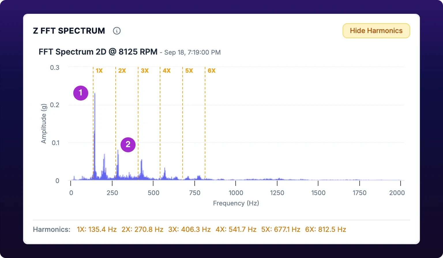 The FFT spectrum with the running speed and its second harmonic marked.
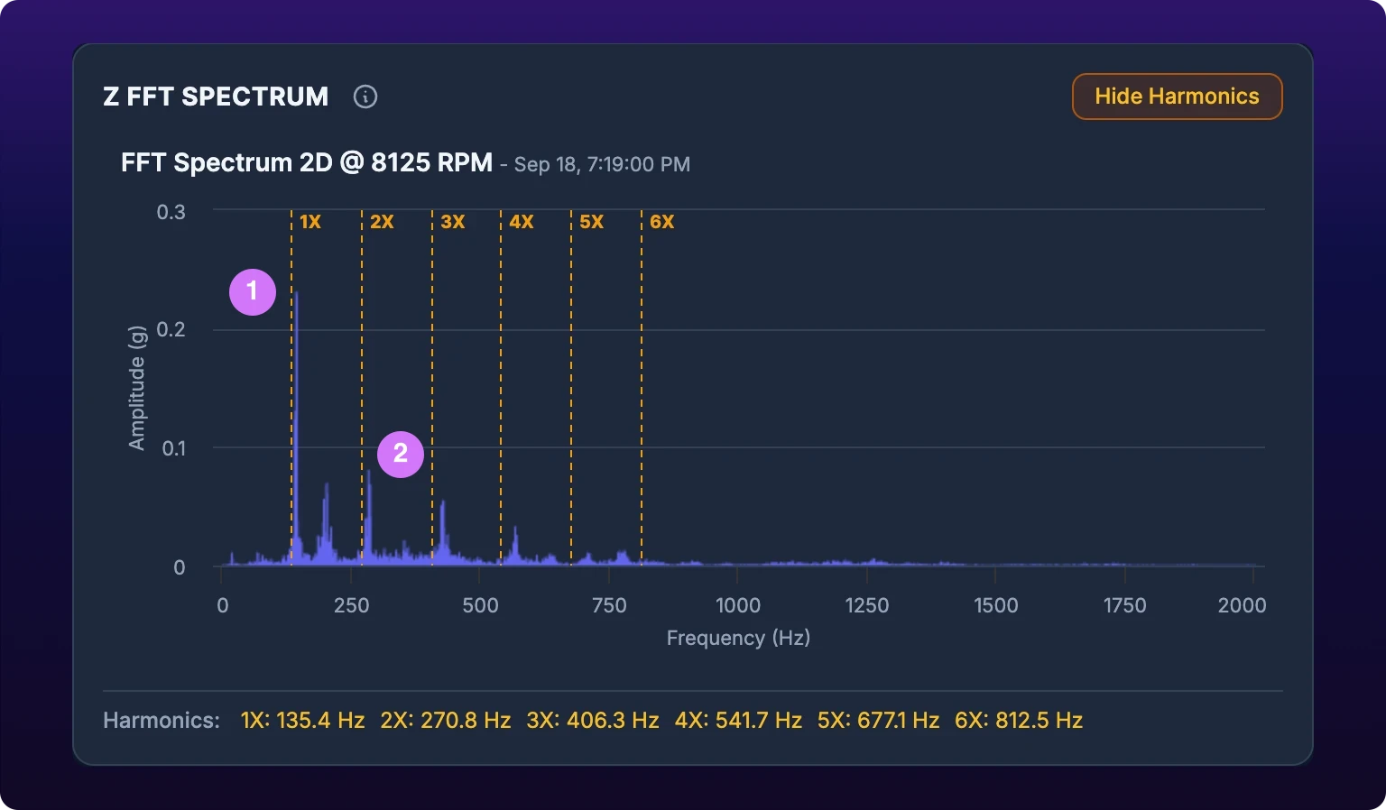
Harmonics and RPM
A harmonic is a whole-number multiple of the machine's running speed. If a shaft turns at 1,800 RPM, that is 30 Hz, and the harmonics sit at 60, 90, 120 Hz and so on, labeled 1X through 6X.
IoTFlows derives the RPM from the vibration itself and shows it in the spectrum's title, for example FFT Spectrum 2D @ 1785 RPM. Harmonic markers are drawn as dashed lines and listed with their frequencies under the chart. They are on by default; click Hide Harmonics to see the bare spectrum.
Where the energy sits against the markers names the fault. A peak on 1X is imbalance. A peak on 2X is misalignment. Energy across several harmonics is looseness, and a cluster well above 6X, unrelated to running speed, is a bearing.
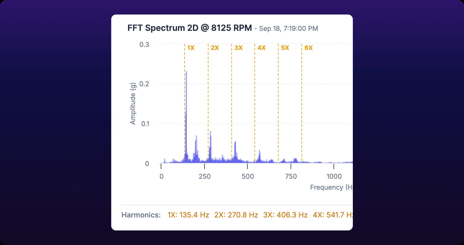 Harmonic markers placed from the machine's RPM.
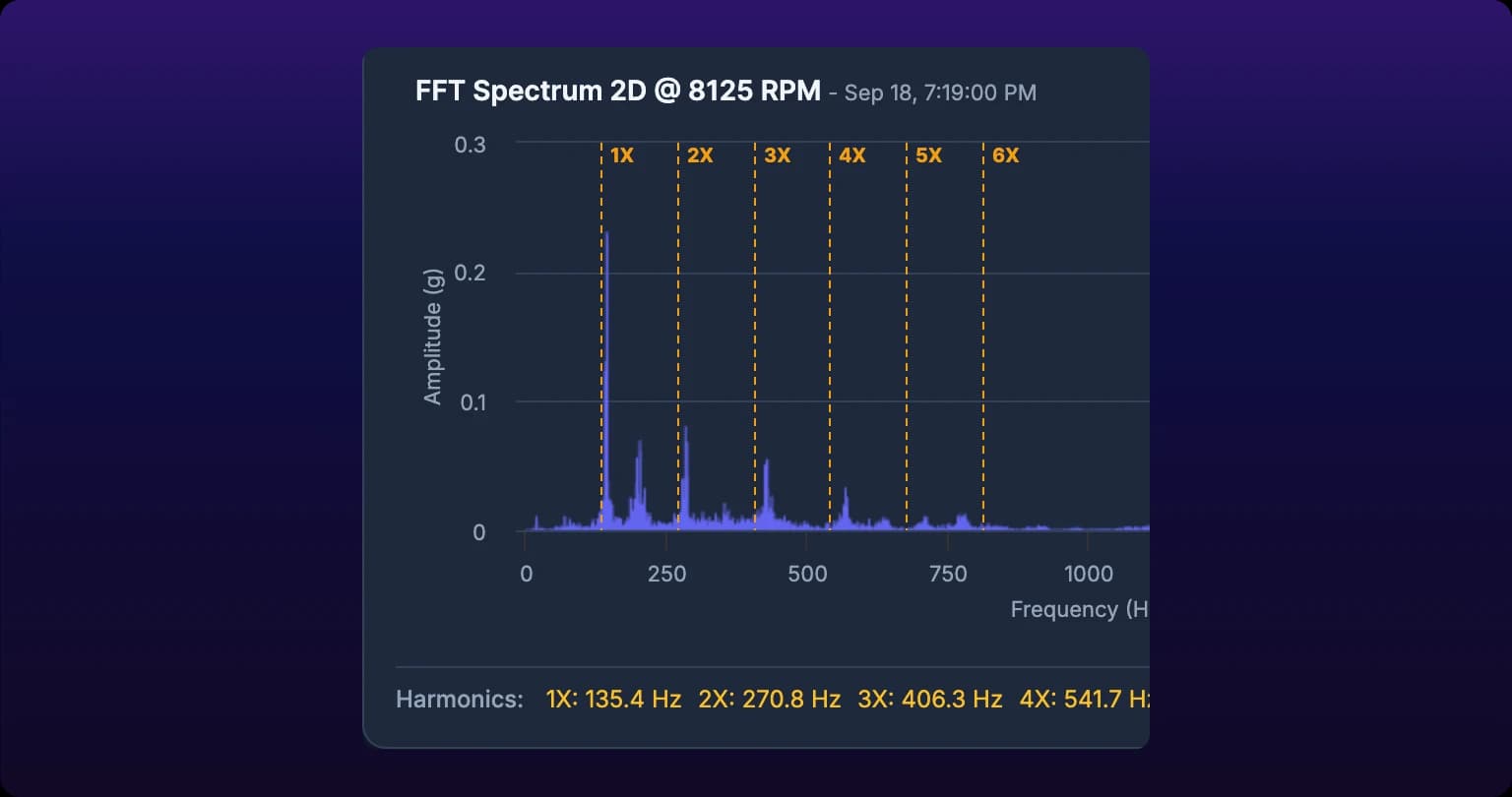
The spectrogram and the 3D view
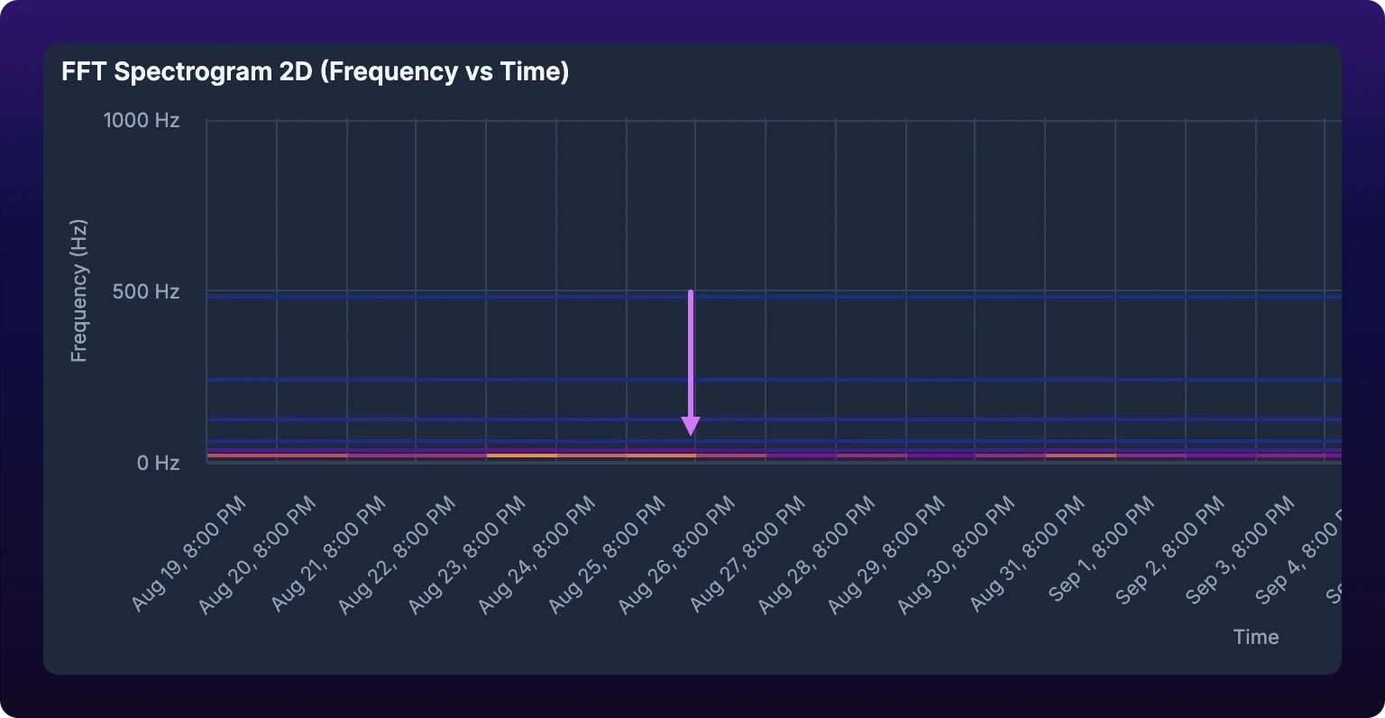
The FFT Spectrogram 2D (Frequency vs Time) chart shows every moment in the range at once: time along the bottom, frequency up the side, amplitude as color. A band that brightens toward the right is a fault growing. A band bright all the way across is the machine's normal signature.
Click anywhere on the spectrogram to select that timestamp. A vertical line marks it and the four spectra load that moment.
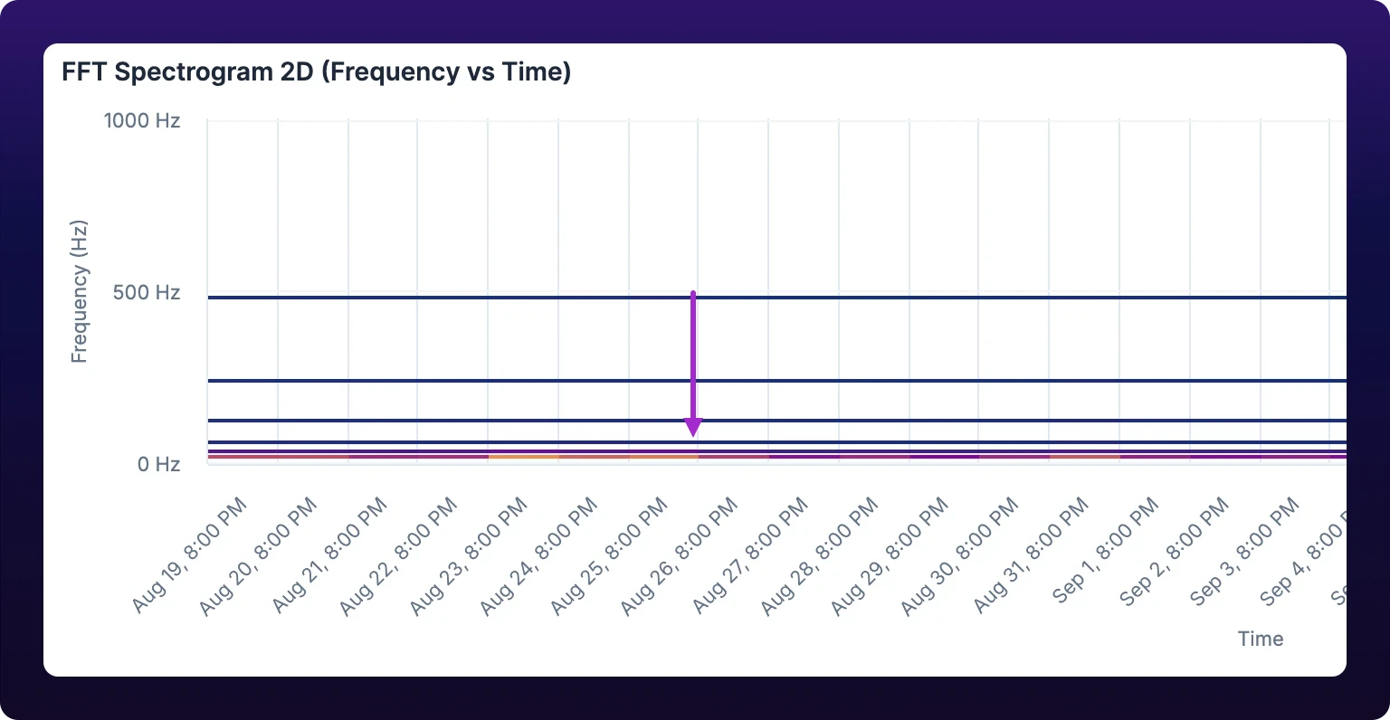 The spectrogram over two weeks. A band brightening over time is degradation.
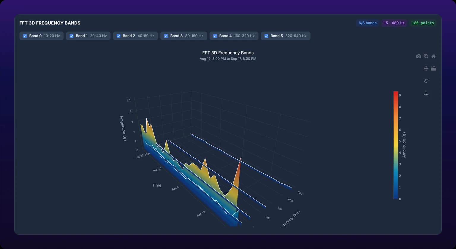
FFT 3D Frequency Bands below it plots the same data as ridges running through time. It reads well on a slide and less well at a desk: the spectrogram is easier to point at, and it is the one you can click.
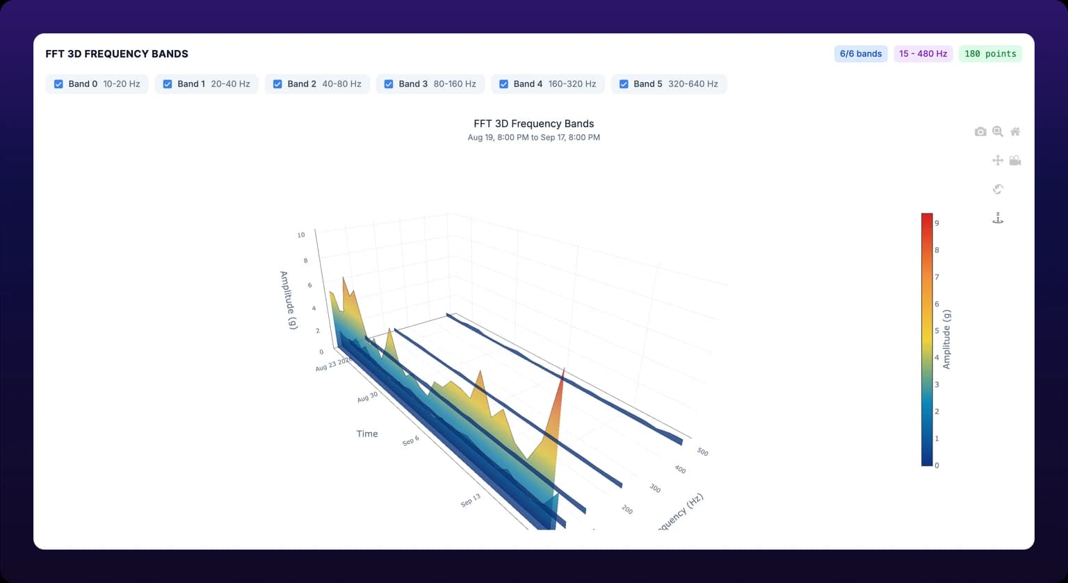 The 3D view of the same data, for presentations rather than diagnosis.
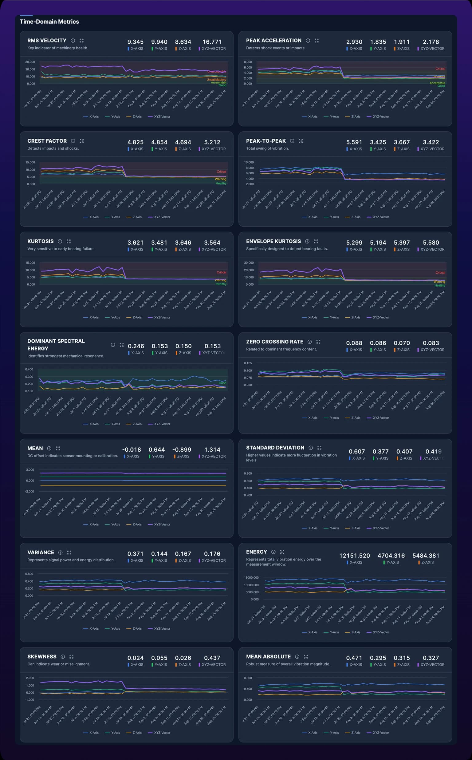
The 14 metric trend charts
The Time-Domain Metrics section at the bottom draws one chart per vibration metric, fourteen in all, each with X, Y, Z and XYZ lines. Two come up often enough to define here.
Crest factor is the signal's peak divided by its RMS. Impacts raise the peak without raising the RMS much, so the ratio climbs. Kurtosis measures how peaked the signal's distribution is. Random vibration sits near 3; a bearing defect adds spikes that push it higher.
Click the i icon on any chart for its definition and the faults it points at. Those panels are the source for the table below.
Health metrics
| Metric | What it measures | Rises when |
|---|---|---|
| RMS Velocity | Overall vibration energy, the effective amplitude of the signal | Unbalance, misalignment, looseness, general wear |
| Peak Acceleration | The largest instantaneous amplitude in the window | Bearing defects, gear tooth damage, cavitation, impacts |
| Crest Factor | Peak divided by RMS | Bearing spalling, gear tooth cracks, looseness impacts, motor electrical faults |
| Peak-to-Peak | The full swing from most positive to most negative | High unbalance, bearing clearance, impact loads, structural looseness |
| Kurtosis | How peaked the amplitude distribution is; about 3 for random vibration | Early bearing damage, impacting looseness, intermittent contact, rubbing |
| Envelope Kurtosis | Kurtosis of the high-frequency envelope, the most sensitive bearing indicator | Race spalling, ball or roller defects, cage damage, lubrication breakdown |
| Dominant Spectral Energy | Amplitude of the strongest frequency in the spectrum | Depends on which frequency dominates: 1X is unbalance, 2X misalignment, high frequency bearings |
| Zero Crossing Rate | How often the signal crosses zero, a rough measure of dominant frequency | Bearing modulation, variable speed, resonance, beat frequencies |
| Mean | The average of the signal, near zero for a healthy mount | Sensor mounting angle, temperature drift, low-frequency movement, calibration drift |
| Standard Deviation | Spread of the amplitude, close to RMS for a vibration signal | Variable process load, intermittent bearing impacts, loose components, resonance |
| Variance | Standard deviation squared, the signal's power | Load fluctuation, a developing fault, unstable operation, resonance |
| Energy | Sum of squared amplitudes over the window | Wear progressing, growing unbalance, bearing degradation, alignment drifting |
| Skewness | Asymmetry of the amplitude distribution, near zero when healthy | One-directional impacts, bearing cage defects, gear tooth damage, structural asymmetry |
| Mean Absolute | Average of absolute amplitude, like RMS but less swayed by peaks | The same causes as RMS: unbalance, misalignment, bearing wear, looseness |
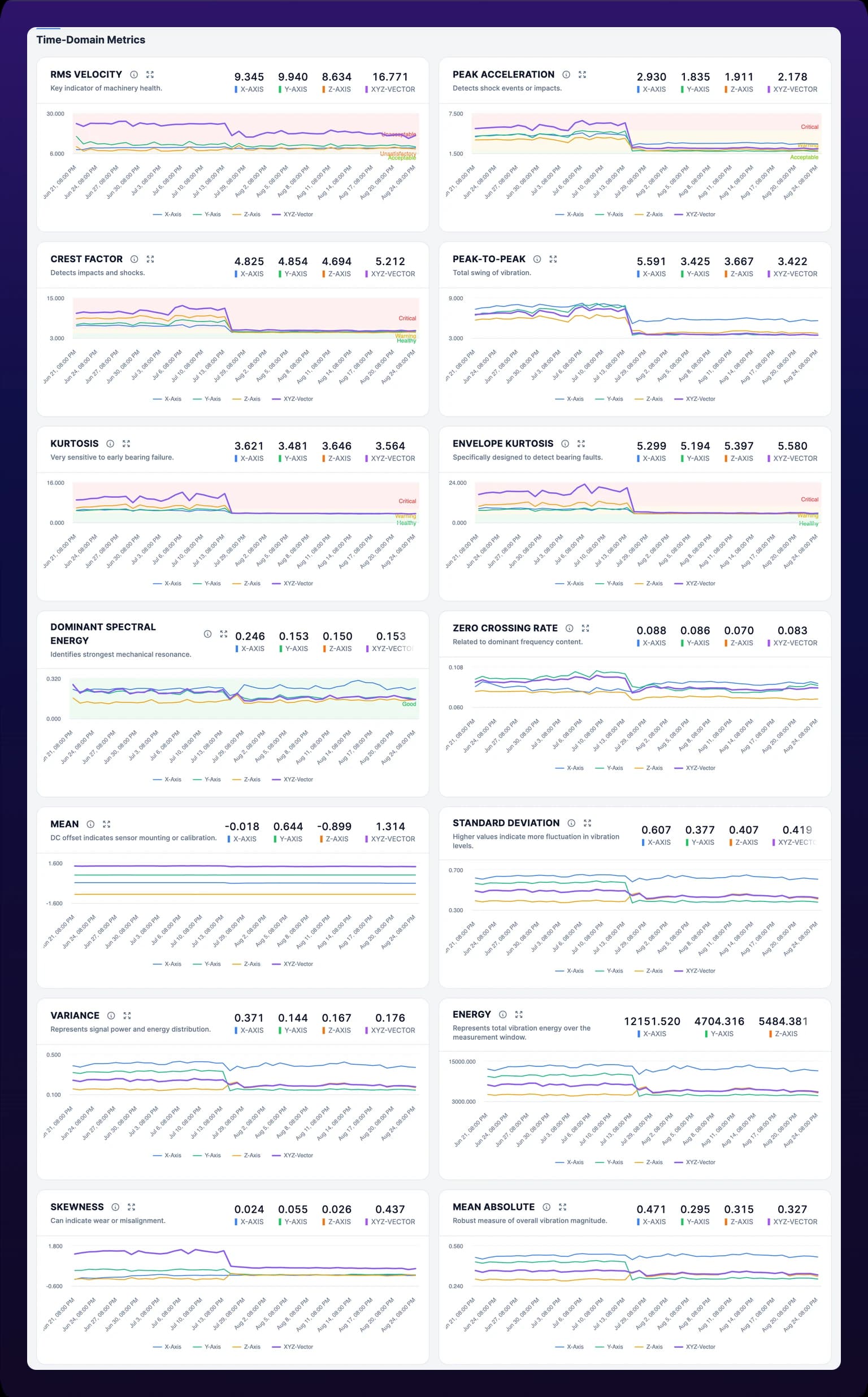 The 14 metric trend charts. The reference table on this page says what each one rises with.
Inspect one moment across every chart
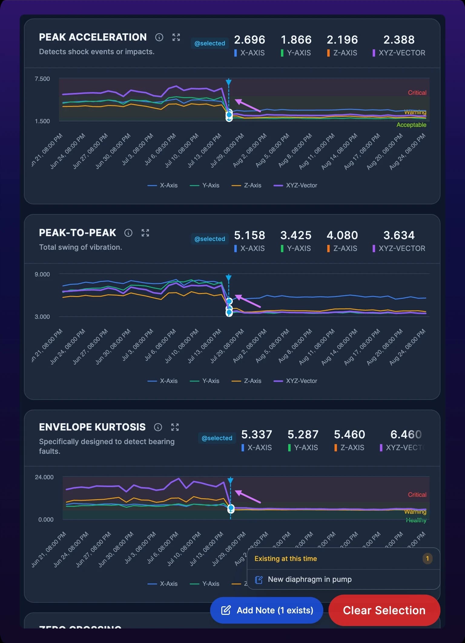
Every trend chart shares one selected timestamp. Click a point on any of them, or on the spectrogram, and the dashboard lines up on that moment:
- A vertical marker appears on every trend chart at the same time.
- The four FFT spectra load the reading nearest that timestamp and show it in their title.
- The Operations Metrics gauges switch to their values at that moment, with the timestamp shown in a blue chip beside the heading, and each metric chart shows an @selected chip.
- A panel opens listing any notes or events already recorded at that moment, with an Add Note button to record one, and Clear Selection to return every chart to the latest reading.
Use it to answer "what did the spectrum look like when the score dropped": click the inflection point on the health score trend and read the spectra. Notes added here appear in the machine's Notes list, see Inspect a single machine, and clicking a note there selects its moment on these charts.
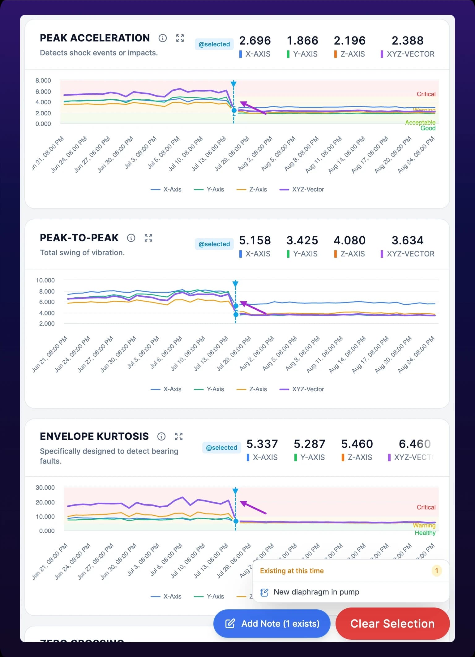 The timestamp inspector lines every chart up on one moment.
Legacy health (firmware below 5)
A SenseAi on firmware below 5 keeps the Health tab but shows the older view: tiles reading Vibration Mean (g), Vibration Std Dev (g) and Vibration RMS (g), a Vibration (g) chart of the last 256 raw samples, a Vibration Spectrogram, and trend charts of mean, standard deviation and RMS with a shaded band for the expected range. It has no score, no gauges, no FFT spectra and no inspector.
A mean or RMS line that has left its band and stayed out is still a machine that has changed. For the full dashboard, ask IoTFlows to update the firmware, see Get support.
What to do with a falling score
- Widen the time range to 30d or 90d and confirm the fall is a slope, not a step that has since recovered.
- Read the Operations Metrics gauges. The one that has left Good names the condition.
- Open that gauge's trend chart and find when it began.
- Click that moment and read the FFT spectra with harmonics on, to confirm which fault: 1X, 2X, many harmonics, or high-frequency energy.
- Open a work order from the event the sensor raised, see Review and dismiss machine events, or create one directly, see Create a work order.
To be told rather than to look, set a health or vibration rule for the asset in Asset event rules.
Errors
| Symptom | Cause | Do this |
|---|---|---|
| No Health tab on the machine's page | The asset carries a BeamTracker | None. A beam sensor reads no vibration |
| The tab shows mean, standard deviation and RMS tiles instead of a score | Firmware below 5 | Ask IoTFlows to update the device, see Get support |
| Charts read No frequency band data available. Waiting for sensor data... or gauges read No Data | The sensor has not yet collected enough samples for a baseline, or the device is offline | Check the device in View your devices, then wait for the baseline to fill |
| Failed to update baseline profile | The profile change did not save | Retry. If it repeats, see Choose a machine health baseline profile |
See also
Four organization-wide rules put a reason code on the stops operators should not have to classify by hand: short downtimes, the start of a shift, the end of a shift, and a machine down for an entire shift. Scheduled break windows add a reason for lunch and breaks. Which rule to turn on first, and which to leave off until the shift schedule is trusted.
Set the reference a machine's health scores are judged against on the Health tab: Dynamic Baseline, four ISO 10816 classes, or one of eight machine-type profiles, which profile fits which machine, and what the confirm dialog recalculates.